Building a Brand from Scratch
Violet OP is one of NYU's competitive VALORANT esports teams, working to bring gaming and esports into a bigger space on campus and beyond. As Head Website Designer, I was responsible for designing and building the club's website from the ground up, including establishing its visual identity.
Duration
Mar 2026 - Present
Company
Violet OP
Services
#
UI/UX design
#
Brand design
#
Visual design
#
Content design

Challenge
How do you design a brand identity when there's nothing to build on yet? When I joined, Violet OP had no color palette, no visual language, nothing to reference. Every decision like typography, tone, layout wasn't just a design choice, it was setting a precedent for how people would see the org going forward. I had to design confidently without a clear answer key, knowing the early calls I made would define the club's identity for everyone who came after.


Solution
With “bold, immersive, and competitive” as the core strategy, I built a foundational visual system for the website:
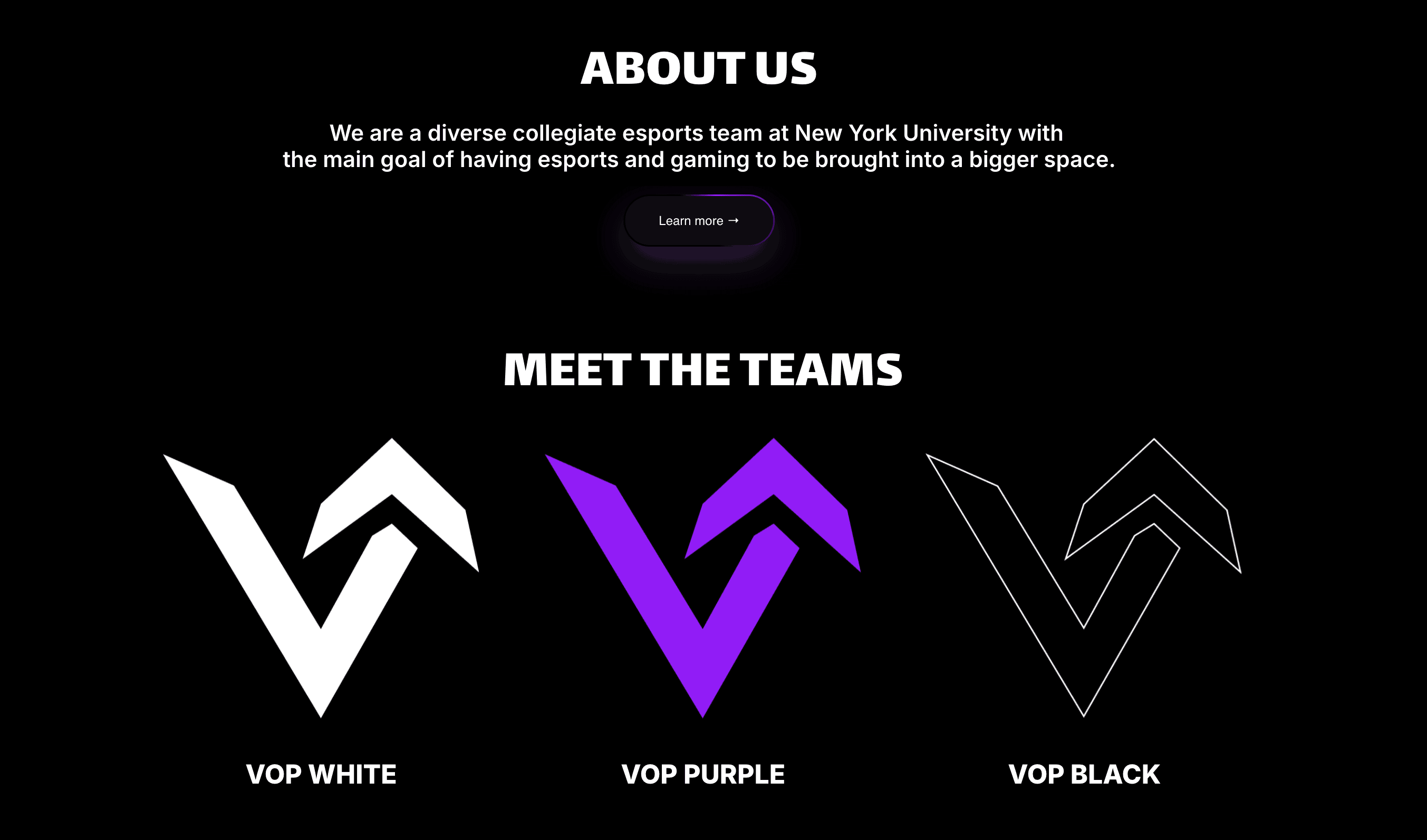
Established a black-and-purple palette as the club's signature look, with black as the dominant background to create a bold, high-contrast canvas, and NYU violet used as an accent to anchor the brand and signal school pride.
Paired bold, thick typography with glowing neon-lit buttons, giving the site an energetic, competitive feel that echoes the intensity of esports and gaming culture.

Impact
This visual system gave Violet OP a real brand identity for the first time, establishing a strong foundation for the club to build on as it grows and competes:
A cohesive black-and-purple identity across the site, teams, and recruitment pages gives Violet OP a stronger, more professional presence to attract new members
A consistent visual language helps build community around NYU esports, giving current and prospective members something recognizable to rally around
A polished, competitive brand image supports the club's ability to represent itself professionally as it expands both on and off campus